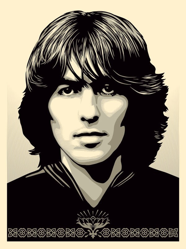
Shepard Fairey George Harrison Poster
Star graphic designer Shepard Fairey (yes, you know him -- think "OBEY" or that Obama poster) has created a new poster of George Harrison, to celebrate/promote the release of The Apple Years 1968-75. I think it's pretty cool. What say you? Please tell me he did this by hand and eye, and didn't just apply a Photoshop filter. That MATTERS to me somehow Interested in purchasing a Shepard Fairey George Harrison Poster for your own cozy little Beatle-infused digs? Be quick and vigilant: "Silver edition to be released 24/10/14 through the George Harrison web store at 10am PST/6pm BST located [...]