

- From Faith Current: “The Sacred Ordinary: St. Peter’s Church Hall” - May 1, 2023
- A brief (?) hiatus - April 22, 2023
- Something Happened - March 6, 2023
Simpsons writer Josh Weinstein argues so in this (hotly debated) article for The Guardian.
Without Yellow Submarine there would never have beenThe Simpsons, no Futurama, no South Park, no Toy Story, no Shrek. No animated anything that enables us to laugh at ourselves while being highly entertained.
Naturally, I want to believe him. In my opinion, The Beatles (and -related) are that clear, burbling spring from which all good things flow. Of course the comments are alive with internet types, people who obsessively leapfrog each other in truth-owning appeals to obscure authority, who defiantly declare that Yellow Sub was/is shite and the REAL breakthroughs were the brilliant, ultra avant garde, but sadly underappreciated animation going on in Japan (or Czechoslovakia, or the USSR) back in the 1920s. To them Weinstein is, variously, Anglocentric or an ignorant American or too “Hollywood” to know anything, which is weird when you’re talking about a movie.
Ha, ha, internet people obsessed with the minutia of some personally activating tendril of pop culture! How absurd! How utterly sad it is to see them tussle over microscopic points of doctrine, instead of being delighted that the world shares with them an enthusiasm.
(Pardon me while I cue up “Artifacts 1, Disc 3: The Psychedelic Years.” Please note it is not the White Album.)
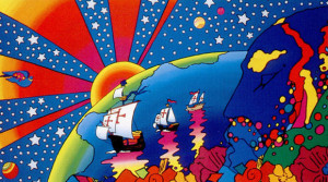
When I see “Yellow Submarine,” I see something never mentioned: the graphic style of Milton Glaser and Seymour Chwast, who were the twin powerhouses behind a design/illustration firm called Pushpin Studios. The person behind Yellow Sub’s distinctive look, a German designer named Heinz Edelmann, was apparently a friend of Glaser’s (he was quoted in Edelmann’s obituary), and I assume Chwast’s too.
This is a famous Glaser poster from 1966:

You’ve totally seen this before. (Glaser did the typeface, too.)
And here’s a Chwast illustration from Pushpin Graphic #52 (1967):


Weinstein gets at at least two big things in his piece: the innovation in YS (no one had used these techniques before) and its influence (seeing it was a watershed moment for him and for others). I don’t know much about specific animation techniques, but I can say that nothing else looks quite like YS. There are certainly identifiable influences, but they’re combined and refigured in a unique way.
As for YS being a watershed (ha! how appropriate), that seems inarguable. The Beatles’ fame and reach guaranteed a wide exposure for the film, and its quality has given it staying power. Weinstein is saying (if I understand him aright) that YS helped him and others see what was possible in cartoons in a new way, and that’s surely right. Terry Gilliam’s work in “Monty Python” is another example of such an influence, I’d say.
And if that’s Anglocentric, so be it. The Brits were doing mind-expanding, innovative things with cartoon and cartoonish art in the 1960s, as you point out, Michael.
On a related note, I love Alan Aldridge’s compilations of illustrated Beatles lyrics for the same reasons I love the song sequences in YS — they’re anything but the usual routine.
I never understood why the Beatles were so dismissive of the film. There are no interviews with them (at least none that I’ve seen) where they said “wow, that was some innovative animation and artwork” Lennon just referred to it as a contractual obligation that they deftly sidestepped by contributing some mediocre songs and a quick appearance at the end.
Were they that jaded by 1968?
– Hologram Sam
Nancy, the interesting thing to me about the design of YS was precisely how international it was, how it was the graphic identity of a particular moment, and how fortunate The Beatles were in that.
Glaser and Chwast are Americans (if you count New Yorkers as Americans, which I do :)–Max was American originally from Germany, Edelmann was German, Alan Aldridge was English, Gilliam was American working in England, and the YS people were English working under American supervision. And YS isn’t simply “psychedelic”–it doesn’t look like the posters being produced in San Francisco, for example. It’s a specific set of graphic techniques, a branch of psychedelic design, that was thriving in 1966-67 when they were going into production. It was the vogue of that time, and lucky for us, it’s beautiful and wears well over time; if YS had happened in 1995, it would have been done in the Emigre style, which I find ugly and dated to the point of personal upset. But that’s just me.
What YS did–and this is directly analogous to what The Beatles did–was synthesize a bunch of things that were bubbling up simultaneously into a single, popular form. And once in that form, it could be grabbed by corporate replication/distribution mechanisms, and made omnipresent. That’s how wide-gauge pop culture influence works, and it’s the kernel of Weinstein’s point; and it’s exactly how The Simpsons has worked to shape things as well.
The Simpsons have some very definite influences/forbears–everything from The Harvard Lampoon 1975-1985; “Kit and Kaboodle” in National Lampoon ca 1973; all of Groening’s personal influences–and Meyer/Schwarzwelder’s, and Sam Simon’s. Plus the half-hour sitcom form, and FOX’s needs and desires, and…
But it’s The Simpsons’ idiosyncratic, personal, imperfect synthesis of these influences that have carried them forward in our culture, and that’s something to acknowledge. And then one also acknowledges the things that are NEW about The Simpsons and The Beatles and YS. And then one marvels, and goes to take a nap.
What if the Beatles cartoons production team had done Yellow Submarine? It would have looked like this:
http://www.youtube.com/watch?v=6-457pYItC8
According to the description, “unlike older stereo versions of this song, AND the newly remastered “Magical Mystery Tour” CD, this does NOT revert to rechanneled fake stereo after the second verse.”
– Hologram Sam
And yet I don’t remember any of the Beatles being particularly impressed with it. I could be wrong. I don’t recall any interviews where they spoke highly of the film.
Lennon seemed to view the whole business as an annoying contractual obligation that they neatly sidestepped with some dashed-off tunes and a brief bit of horseplay at the end of the film. They couldn’t even be bothered to speak their lines.
Are there any interviews anywhere where they acknowledge the groundbreaking nature of Yellow Submarine? Were they really so jaded back in 1968?
– Hologram Sam
[…] Fields”); the creation of Yellow Submarine, a Beatles movie without The Beatles that still manages to be great; them coming together in the identity-expanding Pepper, a Beatle LP with no moptop in sight; […]